soap! 2014 - summary of day 2
Today, we've got another translation provided by the soapy team. It's the day 2
summary. The Polish version is available
here. Enjoy! Day 2 of the soap!
conference brought even more presentations that were divided into two tracks.
Everyone could find something for themselves. Unfortunately, we weren’t able to
attend all the presentations, so we describe in short only some of them.

Trust Above All
And not only in a relationship. Rahel Ann Bailie talked about the importance of building trust among our customers. First of all, building trust is a continuous process. Once built, the trust doesn’t last forever, so we need to constantly maintain it. Our surroundings generate more stimuli than we can process. We receive too much information, so we approach it selectively and choose what we want to focus on. It’s the so-called “cocktail party effect”. We pick out a single stimulus and filter out the rest treating it as background noise. It’s similar to attending a party during which we are able to focus on a single conversation in a noisy room. We subconsciously choose the conversation on which we focus before we join it. The level of engagement in the conversation depends on the level of trust. Rahel also mentioned that our reactions in everyday lives when we so to speak function “offline”, aren’t different from our reactions when we are “online”. We experience the same feelings of acceptance and rejection in both situations. The current generation looks for the social proof. That’s why we can’t treat social media simply as another channel for providing content. Such an assumption leads us to one-sided communication which isn’t social in any way. User response is necessary. It isn’t about the number of likes and people who follow a post or a profile. It’s more complicated, just like people are. Rahel mentioned the Cluetrain Manifesto. Adding new content isn’t enough, we need to talk with the users. Only then we can gain their trust.

Badly Written Instructions Can Kill
Such a terrifying vision was presented by Ray Gallon. He started his presentation by describing a situation that occurred in Epinal, France. 24 patients suffering from prostate cancer were exposed to an excessive amount of ionizing radiation. Five of them died. It turned out that the tragedy occurred because of human error, a badly designed interface of the machine and the lack of instructions in French. The content should be designed so that it helps users undertake better decisions. Using documentation, people want to learn what our product is for, how to perform certain tasks, and what choices are available. They also want to understand why they should perform a given task and what are the most important parts. That’s why we should show users the easiest way of achieving their goal and describe the remaining options in a place where they will be able to find them easily. Ray drew our attention to the fact that the main communication channel between the customers and the company is the company’s product because the customers spend the majority of time with it. Users are irritated when they waste their time. That’s why the content that is displayed on the user interface of our product must be well-designed as it translates directly into user experience. Customers don’t care about silos. They communicate with a company, not with its separate departments. Thus, we have to create integrated communities inside and outside of the company. We have to listen to what our customers have to say. We won’t always hear what we’d like to, we don’t always have to accept all remarks, but our duty is to listen to the users. Such communities need animation that stimulates rather than moderation that suppresses. How can we incorporate user opinions into the product? The traditional model assumes that we have a company on the one side and the user on the other side. Technical communication that later on influences the product is in the middle. In a modern approach, the company and users are a single community in which the users communicate with the company through the product and have a real influence on its shape. By including users in the decisions about the product, we build their loyalty. We should thank them every time they help us.

The Author Is Also Human
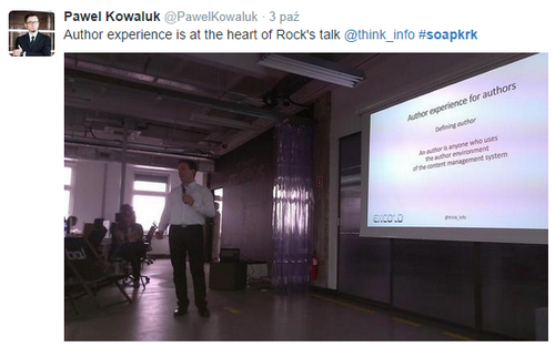
Information is a two-way road and thus we can’t focus only on the end user. We also need to remember about the author and his experience, as we were told by Rick Yagodich. Rick tried to show us the pain points of content management systems. The majority of CMS platforms aren’t built to facilitate business but to offer extra functionalities. There’s a considerable gap not only between various programs but even within one program. Terminology and the way of performing various actions aren’t consistent. It makes users feel at loss. Poorly organized systems are frustrating, frustrated users can’t focus and thus make more mistakes. That’s why we should remember about consistency and content reuse. The same message should be delivered through all communication channels in the same way. Our content should adjust to each channel. We can’t punish the user for using one platform instead of another, for example a mobile phone, for accessing our content. The systems should be holistic, all components should communicate with one another. A good example is Amazon whose warehouse system is linked with the website that is used for ordering the goods. We must remember that content management isn’t about technology but about business. That’s why it’s necessary to make content management easy.

Draw Instead of Saying
Or present it in the form of an infographic to be more precise. Agnieszka Tkaczyk talked about her adventure with creating infographics. The forgetting curve shows that we forget 50% of what we read after 24 hours, and almost everything after a year. Of course, it depends on a number of factors, however the general trend of information retention is clearly visible. After three days, we remember only 10% of the text. However, when it’s supported with images, the amount of remembered information increases to 65%. That’s why substituting a part of the documentation with infographics is worth consideration. An infographic consists of data visualizations (e.g. charts), images, and text. It’s important for the images to be closely related to the topic because only then they reinforce the message and cause the users to pay more attention to the content of the infographic. Agnieszka presented how an infographic should be built. It turns out that, just like the old good essay, it should have an introduction, a body, and an ending. The introduction should draw the attention of the user and present the topic of the infographic. In the body, we go to the heart of the matter by using a combination of text, images, and data visualizations. In the end, we provide a summary of the presented information. Agnieszka gave us a couple of tips about creating infographics. One infographic should focus on one big story rather than a couple of small stories. It should be clear and contain only data that is important. We need to remember about limiting the amount of text to minimum and focus mainly on visualizations. Accuracy of our infographic is also important. Visualizations must match the numbers and the text. We should quote the sources of the information and inform users if the infographics might get outdated. Each inaccuracy in the infographic makes it lose its credibility. The speaker also gave pros and cons of creating infographics. First of all, infographics are faster to read and remember, plus creating them is fun. However, it doesn’t change the fact that not all documents can be changed into infographics. What’s more, infographics might not be treated seriously. Creating infographics is also time consuming, requires additional software and a good publication place. At the end of her presentation, Agnieszka showed a couple of examples demonstrating how infographics can be used to limit the amount of documentation. One of the examples was an infographic that showed a 7-step installation procedure. The same process was described in the related documentation in 329 words. Another example was a color-coded infographic about the product infrastructure. The related documentation consisted of 457 words.

Find a Common Language
The management team not always sees the same value in a well-designed content as
people who create that content. Noz Urbina tried
to show what methods and arguments we can use to change the point of view of our
managers. We should look at things from the manager’s perspective, think about
the problems that nag them. We should talk with our colleagues, find out what’s
going on around us. It’ll allow us to find out potential problems that our
content management strategy can solve. We need to show how content management
strategy influences the company’s strategy. It’s a part of the company’s
capital. Easy access to information, user assistance integrated with the
product, consistency of the information cause that users perceive the company as
a whole, not a sum of its departments. Good content management strategy is
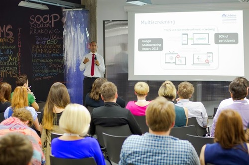
needed also because the world is switching to a multi-channel distribution mode.
The channels are pieces of a puzzle. The users use many channels (Twitter,
Facebook, YouTube) in many formats (computer, tablet, mobile phone) in different
ways. It can be a sequential use when we start an action on one device but
continue on another, or simultaneous use that involves performing a couple of
actions on a couple of devices or one action on many devices. That’s why we must
create content that is consistent and the same regardless of the platform. Noz
heralded the advent of the era of
metadata that is successively becoming
as important as the content itself. Using metadata is time-consuming but it
helps machines better understand the content.
The Google search engine can be an example. The
approach to the results has changed. A few years ago, when you entered a
question “When does ASDA close?” you got a link. Now, you get a concrete
answer.
Noz also touched upon the issue of keeping up with the changes. It turns out
that the strategy of keeping up with the changes is doomed. Instead, we should
introduce the strategy of foreseeing. Rather than watching the competitors, we
should be visionaries. Content influences user experience. Its value is not in
the number of created instructions but in the level to which it meets the needs
of the users. To a large extent, content influences the perception of the brand.
That’s why it’s so important.

Translated: Agnieszka Tkaczyk Proofread: Paweł Kowaluk
